The basic font I am pretty set on:
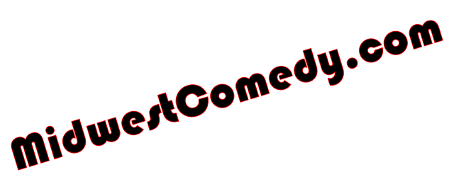
That is "fine", but I just feel it needs a little something extra... so I tried a couple basic things:
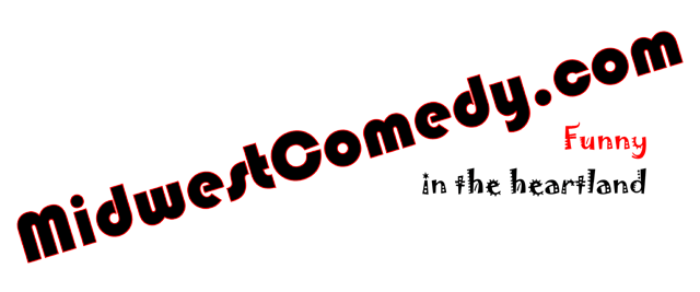
The last one says "Funny" (in red) & "in the heartland" (in black)
Sorry for the low quality images. These are smaller version transparent .gif files so you will have to excuse the sloppy edging.
I want to keep the logo simple, and I am certainly NO graphic designer. I thought about using a laughing face or microphone, but those are soooooo overdone on comedy websites. Maybe I am best off without any added graphics... I'm not sure and that is why I am asking for help!
Please give me your imput, your comments & suggestions are greatly appreciated!
From reviewing my site traffic I have noticed that a majority of search links were from images and the top search word was lesbian... so here is some hot lesbo action to increase the traffic to this post:

~ John V.
No comments:
Post a Comment